BASIC UX is a set of common principles that test something’s overall user experience. The problem that this framework is attempting to address is the need for common UX language and understanding in teams and/or organizations.
Intro
While information about ‘good UX’ is in increasing availability, teams, organizations, and individuals still struggling to define, measure, and agree upon principles of user experience in a productive manner. For example, a lot of UX discussions end in opinion based design arguments. This causes frustration for the people developing a product, and ultimately leads to a sub-par experience for the users of that product.
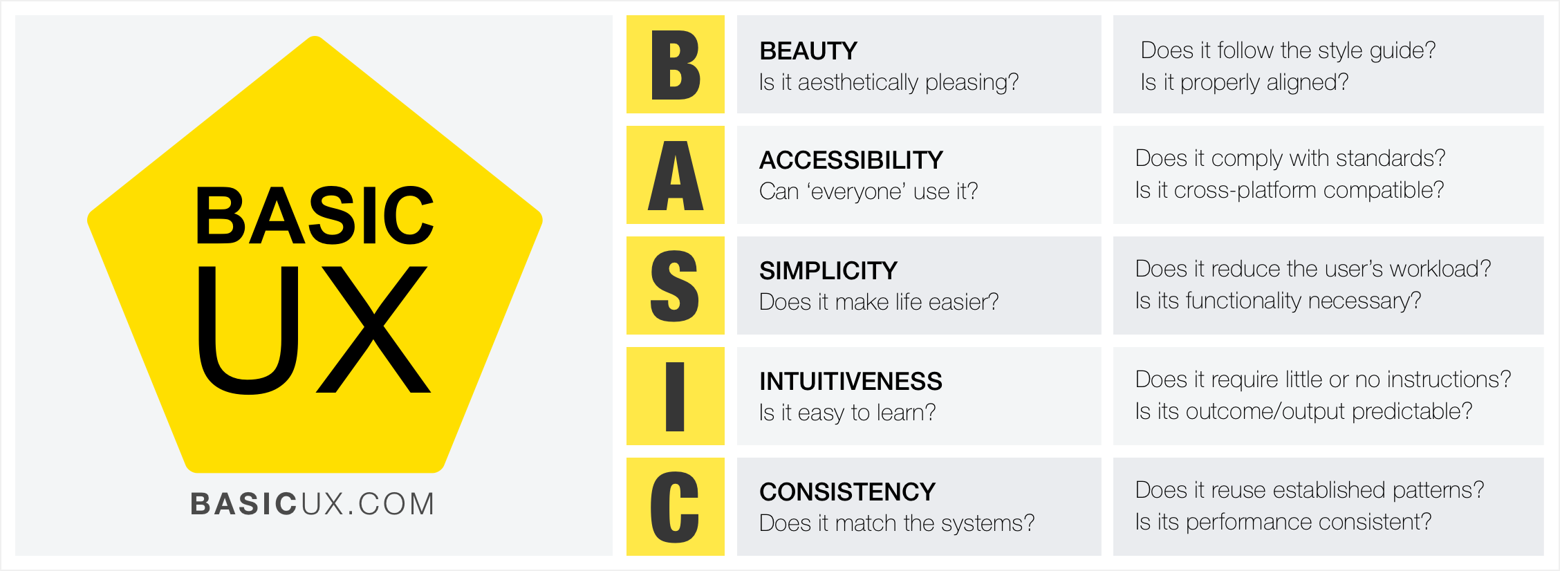
BASIC UX attempts to address this problem by providing a concise set of UX principles for guiding a product's usability design. Those principles are Beauty, Accessibility, Simplicity, Intuitiveness, and Consistency. Within each principle is a set of questions for testing and analyzing a product's UX design. With these standards in place, teams can objectively test, refine and iterate on their product's design in order to bring a superior experience to their end users.
Beauty: It is aesthetically pleasing?
The look and feel of a product is important to the overall user experience of that product. The Aesthetic-Usability Effect* shows that a visually appealing design is perceived as being easier to use than an ugly one. Developers should refer to style guides and design specs for reference to a product’s look and feel. A few minor details in some cases can make a design look ‘off’ and make the product feel ‘broken.’
Questions to ask
- Is it aesthetically pleasing?
- Does it follows the style guide?
- Are high quality visuals used?
- Is it properly aligned?
Accessibility: Can ‘everyone’ use it?
A product’s accessibility is the degree to which it is available and usable by people, regardless of ability. Developers must go beyond the ‘average’ user and ensures that those with less ability to move hands effectively, vision impairment/blindness, and other disability are also able to use the product.
Questions to ask
- Can ‘everyone’ use it?
- Does it comply with standards?
- Is it cross-platform compatible?
Simplicity: Does it make life easier?
Hick’s Law* states that the time it takes to make a decision is proportionally related to the number and complexity of choices. Additionally, Ockham’s Razor* states that simplicity should be the deciding factor when choosing between two identical designs. Developers must then create user interfaces that distill the options to only what is needed to perform the user’s task. Visually, this means balancing use of “white” space and alignments to create associates rather than complex graphics and styling. Principles of Gestalt* informs us that the use of distance, alignments and color similarities can help guide a product in a clean and intuitive manner. For language, this means reducing redundancy, removing passivity and filler words.
Questions to ask
- Does it reduce the user’s workload?*
- Is it free of clutter and repetitive text?*
- Is its functionality necessary?*
Intuitiveness: Is it easy to learn?
The Gulf of Evaluation and Execution (Norman 1986) helps one understand the gaps that users face when using a product. Evaluation happens when the user is trying to understand the feedback a product is giving to determine the current state of the product. A clear course of execution is needed for a user to perform their desired goal. If the path to execution is unclear then the user wont know what to do and will get frustrated. Same is true for evaluation. If the current state is not clear, the user might unnecessarily repeat an action, or feel a sense of anxiety that their task wasn’t completed.
Intuitiveness in BASIC UX is focused on how "learnable" a product and its features are. Very few things are innately intuitive like breathing. Thus, most everything needs to be learned at some point. Using a pencil seems intuitive but is actually a learned mechanic. The critical point here is that a product can be learned and does the user does not need to relearn the product and its functionality over and over again. Also, this learning should be as simple as possible so that learning the product is not a large obstacle to using the product itself. Affordance is another key aspect of intuitive design. Like the color of links or the shape of buttons; these designs give cues to the user about what the elements do. It’s import to realize that most people spend most of their time with other products. So building upon established design patters is key.
Questions to ask
- Is the functionality clear?*
- Can the user achieve their goal with little or no initial instructions?
- Is the task easily repeated by the user without further instruction?
- Can the user predict the outcome/output?
Consistency: Does it match the system?
Consistency is the thread that holds UX together. A beautiful product is consistent. An accessible product is consistent. A simple product is consistent. An intuitive product is consistent. In UX — consistency is the thing that separates frustrating chaos from cohesive harmony. It is important that design colors, spacings, fonts and alignments are consistent throughout the product. Developers should reuse existing and established elements in the system whenever possible. Forms should have consistent alerts, labels, validation, and action behaviors. If consistency is lacking then the entire UX will be as well.
Questions to ask
- Does it reuse existing patterns/designs?*
- Is its language, images, and branding consistent with the system?
- Does it appear in the right place at the right time?*
- Does is perform consistently every time?
*Sources
Beauty
- Aesthetic-Usability Effect - https://usabilityfriction.com/2010/03/30/aesthetic-usability-effect
- Attractive things work better - https://www.jnd.org/dn.mss/emotion_design.html
Accessibility
- ADA Standards for Accessible Design - https://www.ada.gov/2010ADAstandards_index.htm
- W3C Accessibility - https://www.w3.org/standards/webdesign/accessibility
- Section 508 - https://www.section508.gov
Simplicity
- Hick’s Law - https://en.wikipedia.org/wiki/Hick%27s_law
- Ockham’s Razor - https://en.wikipedia.org/wiki/Occam%27s_razor
- Principles of Gestalt - https://vanseodesign.com/web-design/gestalt-principles-of-perception
- Reduce user’s workload - https://guidelines.usability.gov/guidelines/15
- Cognitive load - https://www.nngroup.com/articles/minimize-cognitive-load
- DRY text - https://blinkux.com/blog/best-practices-for-writing-on-the-web
- YAGNI - https://en.wikipedia.org/wiki/You_aren%27t_gonna_need_it
Intuitiveness
- Affordance - https://www.usabilityfirst.com/glossary/affordance/
- Gulfs of Evaluation/Execution - https://www.interaction-design.org/literature/book/the-glossary-of-human-computer-interaction/gulf-of-evaluation-and-gulf-of-execution
Consistency
- Interfaces/Interaction - https://www.uxmatters.com/mt/archives/2010/07/achieving-and-balancing-consistency-in-user-interface-design.php
- Visual hierarchy - https://52weeksofux.com/post/443828775/visual-hierarchy
- Information architecture - https://www.uxbooth.com/articles/complete-beginners-guide-to-information-architecture
Related Articles & Resources
Articles and resources about UX frameworks, including BASIC UX:
- BASIC UX — A Framework for Usable Products - UX Magazine
- BASIC UX Version 0.6 - The UX Blog (Medium)
- 10 UX design frameworks to help you create user-centered products - Maze
- UX Design Frameworks: A Complete Guide - Gapsy Studio
- Top 5 UX Design Frameworks - Vector
- Why UX Design Framework is Needed in Web Development - Bitrix Infotech
- UX Design Frameworks: The Complete Guide - Ramotion
- Landing Page UX Designs: Frameworks and Examples - Apexure